Foxl v0.4.15: The Tabs That Vanished (and the Phone That Forgot)
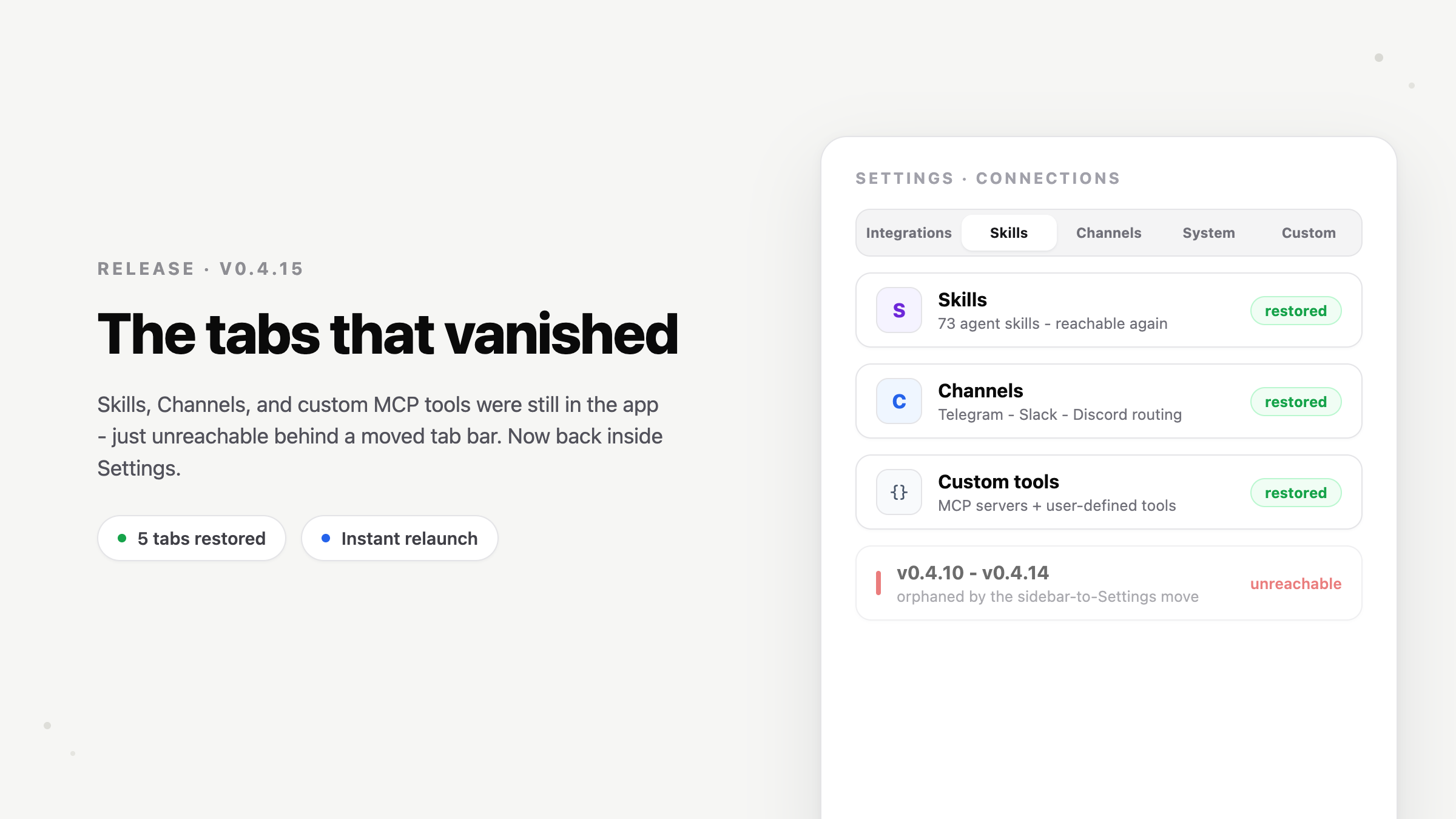
Skills, Channels, and custom MCP tools were all still in the app - just unreachable, orphaned by a moved tab bar. v0.4.15 restores them inside Settings, drops the gradient carousels, and fixes a family of mobile bugs that were all one iOS lifecycle fact in disguise: every launch is a cold start.
On this page
Foxl v0.4.15 started with a bug report we wrote ourselves, in the tone of a user who has just lost something: "where did custom MCP and all the skills go?" Nothing had been deleted. Something arguably worse had happened: the pages were all still there, fully functional, and completely unreachable. This release restores them, redesigns the surface they live on, and closes a batch of mobile issues that shared one root cause worth writing down.
Five tabs, one orphaned tab bar
When Integrations moved from the sidebar into Settings in v0.4.10, it brought only itself. The page had actually been a five-tab hub - Integrations, Skills, Channels, and the System and Custom tool pages where custom MCP servers are configured - but the tab bar lived in the app header, and the app header only renders for the old standalone route. Inside the Settings sheet, the section showed tab one and nothing else. Skills, Channels, and every custom tool quietly fell off the map for anyone navigating the UI.
Settings > Integrations now carries all five tabs inside the section as a segmented control, on desktop and on the phone. The section also owns its own scrolling now - inside the Settings sheet each section must scroll itself, and Integrations didn't, which is why it sat frozen at the top on mobile.
The gradients are gone
Integrations and Skills each opened with a full-color gradient carousel that crossfaded through six stacked layers every five seconds. It was the loudest thing in Settings, and on a phone it was also a steady compositor cost that fought scroll smoothness. Both pages now open with a single flat strip: one featured integration, a real example prompt, and a Try-in-chat button - tap the strip to see the next example. No ambient animation is left anywhere in Settings.
Why the phone kept showing spinners
Three separate complaints - Workspace loads slowly, Usage loads slowly, and the account name gets stuck as "..." - turned out to be the same iOS lifecycle fact wearing three costumes. iOS tears down a suspended app's web process routinely, and every relaunch starts JavaScript from zero. Anything cached only in memory or in sessionStorage is gone; anything that trusted a long-lived session token meets one that expired while the phone was in a pocket.
Workspace and Usage now persist their last real data durably: reopen the app and the file tree and usage numbers paint instantly from the previous visit while a background refresh replaces them. The "..." bug was the same story with a token: the profile lookup sent the expired session token, got rejected, and never retried - on the web a manual refresh papered over it, but the app has no refresh gesture. The lookup now refreshes the token first, re-runs whenever a refresh happens or the app returns to the foreground, and keeps showing the cached name instead of blanking while it revalidates.
Small mobile things that weren't small
A tall message bar - a multi-line draft, a pasted-text card - used to sit on top of the last messages with no way to scroll them clear, because the conversation's bottom scroll room was sized for the one-line bar. The scroll area now tracks the composer's real height, and if you're reading the bottom, the last bubble rises with the bar instead of sliding under it.
The X that removes an attachment from the message bar only appeared on hover. Touch screens do not hover, so on the phone there was no visible way to remove an attachment at all. The X is now always visible on touch devices as a quiet gray chip, slightly larger for the finger - and desktop adopted the same gray on hover, because removing a draft attachment is routine, not destructive, and it never deserved alarm red. And the Usage Breakdown chart in Account folds behind its headline total on mobile, so the number you actually check stays on screen instead of below a dozen bar rows.
The lesson we keep re-learning
Two patterns from this release generalize. First: when a surface moves, grep for what pointed at it - the five-tab bar was one `header only renders here` assumption away from orphaning four pages, and no error anywhere would ever say so. Second: on iOS, treat every launch as a cold start. Memory caches, session storage, and unexpired tokens are all desktop assumptions; the phone violates each of them several times a day, and every violation looks like "the app is slow" or "the app forgot me" to the person holding it.
Upgrading
The web app at app.foxl.ai updates automatically. The desktop app updates itself, or grab the latest from the Foxl homepage. The iOS build is rolling out through TestFlight. The full list of changes is in the changelog.
References and further reading
- Foxl v0.4.15 changelogRelease
- Download FoxlReference