Nothing on the Screen Was Bigger Than Anything Else
Twenty-two releases in seventeen days, v0.6.0 through v0.6.21, and most of what changed was the interface. Every page title on a phone rendered at 22px instead of 28px, so a channel label and a screen name came out identical and no screen had a place for the eye to start. This is the whole design pass: the thresholds that settled it, 477px of Settings spent on one field, 124px of empty band above the keyboard, and the six changes that passed every check, shipped, and had to come back out.
On this page
Between August 10 and August 26 Foxl shipped twenty-two releases, v0.6.0 through v0.6.21. Most of what changed in them was not a feature. It was the interface: type sizes, navigation, colour, motion, the space under a keyboard, and a great deal of chrome that came out entirely.
This is the record of that pass, and of the rule it ran on: where a design decision has a number, the number is the decision. Not a preference, not a review comment - a threshold you can check. The interesting part is not the rule. It is that six changes cleared every threshold we had, shipped, and had to come back out anyway.
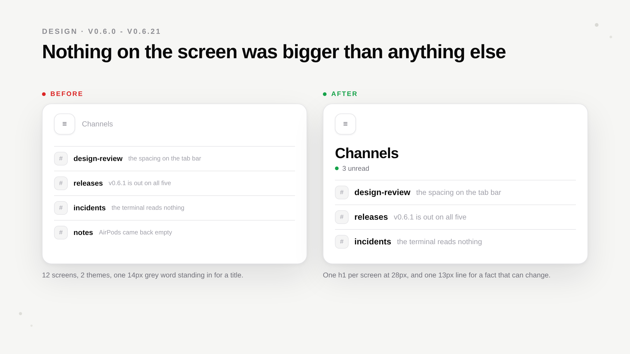
Nothing on the screen was bigger than anything else
Page titles on a phone were meant to be 28px. They rendered at 22px, on every screen, in both products, because one stylesheet rule aimed at the whole app was quietly overruling each screen's own setting. It flattened the other direction too: a 14px channel label and a 28px page title came out identical.
That is a hierarchy defect rather than a typography one. With nothing on a screen bigger than anything else, no screen had an obvious place for the eye to start, which is most of why the phone felt busy.
The measurement underneath it was worse. Taken at 390x844 across twelve surfaces in both themes: every single screen opened with the same 44px puck at top left and the same 14px muted grey word beside it. Twelve screens, one anonymous chrome, no screen with an identity. Chat, the default landing, opened onto 500px of empty background with three suggestion cards floating in the middle of it.
The apps we sit beside on a phone all do the same thing as each other. Claude iOS puts a 34px serif screen name at the top. Codex iOS puts its own name and then a live status: a green dot and the word "Mac". Slack puts a 28px workspace name and an avatar. The pattern is not "large text". It is that the top of the screen tells you where you are and what state the system is in, and the bottom of the screen is where your thumb goes.
So every screen names itself once, at 28px, semibold, left aligned, in the content column - and the header bar on a phone carries no title at all. That inversion is the fix for a real defect rather than a preference: the shell header printed the nav label in 14px grey, several pages also printed their own heading, and the app had grown a list of nine navigation ids whose header copy is hidden to stop the duplication. Two title systems, one suppressing the other. The pages that were not on the list got only the grey one, which is exactly why no Foxl screen had ever read as having a name. One component draws it now, and there is no list to keep.
The order of those two events is the part worth keeping. The rule landed first, and then shipped for several releases doing nothing visible, because the app-wide stylesheet rule was quietly winning against every screen that asked for 28px. So the new title system was live, correct, reviewed, and rendering at the old size. A design rule with no number attached to it cannot detect that; a rule that says 28px can.
The line under the title carries a rule of its own: it is for a fact that can change - 3 unread, Connected to Mac, Recording 04:12, 2 running - and never for a description of the feature. A returning user reads "The Feed timeline aggregates agent activity, heartbeat runs, and schedule results from your desktop" precisely zero times. That rule cut in both directions in the same release: Foxl Code's Work page opened with three lines explaining what issues and pull requests are, which are kept for a wide screen and dropped on a phone, and the phone home screen's permanent grey "Ready" line went entirely. Connected now says nothing at all. An unreachable desktop is a warning.
The sidebar we shipped, and then shipped back
v0.6.8 rebuilt the navigation and then reverted it inside the same release. It is worth writing down, because the first version was not wrong about the problem.
The shell had a product variable - agent, notes or code - set by a segmented switcher in the sidebar header. Each product had its own navigation, its own phone tab row, its own home page and its own Settings row. Every cost below was measured in the tree it replaced:
- It had to be kept in step with the location, and it drifted twice. Pressing Back after switching products left the sidebar on one product and the content pane on another.
- Switching lost your place. It always landed on that product's home, so Files, then Notes, then Agent did not come back to Files. A control advertised as a context switch behaved as a reset.
- One product had no navigation at all. The Notes group was literally empty. A peer of Agent and Code with zero destinations is not a peer; it is a destination.
- The mode hid two thirds of the app. From inside Agent there was no way to see that a Code task had finished or that Notes was recording. The information existed; the control that owned those products carried none of it.
- On a phone the primary control rewrote itself. Tab rows were per product and could hold another product's destination, so tapping a cell could replace the row it was in - and on the Notes editor the app's main navigation was absent altogether. An iOS tab bar is fixed for the life of the screen, and that is what makes it a map instead of a surprise.
- The boundary generated duplicate nouns. Files, Schedules, Tasks and Settings each existed twice, once per product, and two more pairs had already been deleted before this. Eleven separate pieces of code existed only because "which product" was a variable.
So the products became rows in one tree and the switcher went. It shipped. Then it came out again, and the reason is space rather than principle: three rows plus their separator sit at the top of the sidebar, above the pages and the object list of the product you are actually in. On a phone the drawer is the whole screen, which makes that the most expensive real estate in the app. In Foxl Notes, Agent sat between the Notes row and your own recordings. Ordering the rows current-first was tried as the fix and rejected, because it moves the cost around without removing it. The rows themselves are the cost, and a 40px segmented toggle carries the same three destinations in the height of one row.
What was kept is everything that was never about the switcher:
- Real buttons with
aria-currentinstead of tab roles. The old roles overrode the native button role, so the control did not exist in the accessibility tree at all and a query for the button named "Code" fell through to the Settings row of the same name. - Per-section memory. A product row lands on where you were in that product, so leaving one is cheap - which is the whole difference between a section and a mode.
- One tab bar for the whole app, fixed, four cells: Chat, Notes, Tasks, Channels. Still yours to change, but one row to change instead of three.
- One Settings row instead of one per product.
Two smaller reverts sat inside that one, and both were rejected by a person looking at the result rather than by a check.
The active product row was the accent colour first. It used the token defined for "interactive, focus, active", which is the wrong token for that row for a reason the reference apps agree on: a section header is not where the highlight goes. Notion, Linear and Slack all leave the parent alone and put the one highlight on the selected item, and where Slack does spend its accent it is a fill under white text rather than a hue on a label. Tinted text on a parent made one row shout while its own pages sat quiet underneath it. The levels are weight and icon stroke now - 600 and 2.25 for the product you are in, 500 and 1.75 for the other two, 400 and 2 for a page - with the selected pill still marking the current page and aria-current carrying the same fact, so nothing rests on a weight alone.
The pages were indented 12px first, and that was a defect rather than a refinement. There is an icon on both levels, so an indent means two icon columns; and at the 48px collapsed rail, where the labels are gone, the ragged column is all that is left. Measured on the shipped rail: section glyphs centred at 24px, page glyphs at 16px, and the recordings row's glyph at 0. The fix is not a better indent value. It is no indent, one column at every width, which is also what Slack, Notion and Linear do for a two-level navigation. Indentation belongs to trees.
The numbers that are the rule
The standing rule is one line: where a rule is a measurable threshold, the threshold is the rule, so you check it with a number instead of eyeballing it. A fair number of v0.6's design changes are nothing but that.
- The muted text colour is 40.6% lightness rather than shadcn's 45.1% default, and it is the clearest illustration of why. That default clears the 4.5:1 floor only against pure white: it measures 4.30:1 on the tinted sidebar and 3.83:1 on a selected sidebar row. 40.6% is the lightest value that passes on every light surface it can land on. A colour that passes on white and fails on a muted panel fails in the one place nobody looks.
- Eighteen colour themes, and all 396 text-on-surface pairings across them were measured against the AA floor before any of them shipped. Emerald, Monokai, Solarized, Dracula, Nord, Tokyo Night, Gruvbox, Catppuccin, three AMOLED variants and the rest, each a full palette with its own light and dark rendering, so a theme composes with the light/dark switch instead of replacing it.
- Fourteen surface washes, each tuned so the sidebar's labels keep exactly the contrast they have with no wash at all. A gradient can only be darker than the surface it replaces, so the label colours are re-derived over the deepest point of every ramp. Turning the feature on never costs legibility, in either theme.
- One red means unread, everywhere. The bell badge, the sidebar footer badge, the phone tab bar badge and the dot on a notification row are one value. For several releases they were a blue dot under a red badge, which is two vocabularies for one fact. The dark badge fill measures 2.82:1, which is 6% under the floor, and that is written down rather than hidden: going one step lighter fixes the fill and drops the count sitting on it to 3.49:1, so the fill stays and the honest remedy is a contrasting boundary.
- A single phone number is arithmetic that only holds on one device. The conversation list in the drawer was capped at 176px, reasoned from a 390x844 screen where four rows put the Code row just above the fold. That cap applies to every screen under 640px wide, so a 375x667 SE got the same 176px on a screen whose fixed chrome alone is taller than its body, and a 440x956 Max got it with room for two more rows. It is stepped by height now: 132px under 760, 176px at 760 and up, 220px at 900 and up. What it buys is stated without overclaiming - at 844 and up it is what makes the whole tree reachable without scrolling; on a 667px screen nothing does, so there it only keeps the list from eating a third of the screen.
Two of those measurements were wrong the first time, in ways worth repeating. Tailwind v4 emits oklab(...), so pulling numbers out of a computed colour with a naive pattern reads lightness as the red channel - a perfectly legible label scored 1.19:1. Resolve the colour through the browser. And contrast has to be composited against the full ancestor stack, translucent glass included; skipping one layer at 0.55 alpha invents a failure that is not on screen.
Chrome that answered nothing
The largest single category of change across v0.6 was subtraction, and it runs on one rule: a button that does what its row already does is not an affordance. If the container is tappable and the control inside it calls the same function with the same arguments, the control doubles the row's height and wins the squint test against the content it belongs to. A button earns its place by expressing a choice the container cannot: approve or deny, install or later.
That was measured rather than asserted. The notification list rendered one solid black "Open" pill per row whose handler was, character for character, what tapping the row already ran; three of them down a narrow panel were the loudest thing on screen. They are gone, and buttons now appear only where there is a real decision, as quiet tinted labels. The same rows also dropped a small coloured square holding a sparkle, a clock or a hash, each repeating what the row's own first words said, so a list of twelve kinds of notification had been a column of twelve coloured squares.
The same test took a lot out of Foxl Code:
- The strip under a local terminal. An agent list, a folder list, a switch, and the line "Runs as you, on this computer. Stops when it sleeps." Four rows of settings under the output of a session none of them could change, on the one screen where the terminal's height is the whole point. The rule that replaced it: a fact about the next pane belongs beside the verb that opens one, a fact about this pane belongs on the control it qualifies, and a setting belongs in Settings.
- "New cloud panes run Claude Code (account default)". With four panes open you saw four copies of one setting, under output that none of them applied to. It is the third segment of the button that opens a terminal now, which reads left to right as what it does:
+ | This computer | Claude Code. - The Runtimes toolbar - a pane count, a New terminal label, a "Watch a run" picker, Equalize and Zoom - stacked directly under the header on the one screen where height is the point. Most of it was already somewhere better: the count is the sidebar's list of open terminals, and Zoom is a button on each pane's own header.
- The autonomous activity panel, whose collapsed state was one line about whether the machine had been busy. A panel reporting that nothing had happened is the one thing on a home screen that never helped.
- Foxl Code's home screen, which had grown a board of up to 24 task rows, a footer counting the ones it did not show, and that panel. On a phone the whole stack is centred in the space above the message bar, so it pushed the mark and the heading clean off the top of the screen: the app opened on a wall of rows with nowhere for the eye to start. What survives is the one line that reads at a glance,
0 awaiting input · 4 working · 77 done, directly under the question. - The default coding assistant in Settings. Six full-width cards, each a mark, a name, a description and a status chip: 477px of the pane spent on one field, which pushed the model and budget controls below it off the screen. One 38px row now, the same shape the model provider picker always had.
- A three-cell Total / Enabled / Total runs strip above the Schedules list, restating the line directly above it, two of its three cells usually reading 0. Desktop only now, and the first schedule starts about 80px higher up the phone.
- Two of the three icons at the top of the Files list on a phone. Open-folder reveals the workspace directory in a desktop file manager, which a phone does not have, so it was a control that could only ever do nothing; search duplicated scrolling a list that is already the whole screen. Refresh keeps the 44px chip that matches the sidebar toggle beside it, and the desktop toolbar still carries all three.
The phone that behaves like a phone
v0.6.6 is the release where the iOS app picked up the native behaviour it had been missing.
- Interactive gestures. Sheets that leave the screen visible behind them lift off a stack the way the system's do, with that screen settling back as a card, and they answer a flick by where it was headed rather than by how far it happened to travel. Pull a list past its top to refresh. Tap the status bar to jump back to the top.
- The real long-press menu: the row lifts, the rest of the screen blurs, Rename and Delete arrive with a haptic. Before this the long-press did nothing at all on a phone - and once it worked it worked twice, two menus stacked on each other, plus a stray system one that appeared over the pet, over the Files and Channels rows and even over the sidebar toggle, because it was still tracking chat rows sitting behind a closed drawer.
- Dynamic Type and the system typeface. Foxl was the one app on the phone that did not move when you changed Display text size. Body text is San Francisco with the platform's own spacing now.
- A destructive confirm is an action sheet, the dangerous choice in red at the bottom edge under your thumb with Cancel set apart, rather than a dialog whose two buttons looked the same.
One of that release's gestures did not survive contact, and it is the sixth revert. v0.6.6 gave the left screen edge to an interactive swipe-back - the screen following your finger with the one underneath sliding in behind it, which is what every iOS app does. It is out again in v0.6.7, because the sidebar already owned that edge. The two cannot share it: both are the same drag from the same 24 pixels, the back gesture engaged first every time, and so the drawer's swipe silently stopped existing - the gesture people had been using to reach their chats started navigating backwards instead. The edge belongs to the sidebar. Back is a tap on the Back chevron in the headers that draw one, and Android's own system gesture was never involved.
Motion is the one item on this list that predates the version line rather than arriving with it, and it is worth restating because every animation above obeys it. Everything in the app used to be a CSS cubic-bezier, which is why the motion read as cheap: a bezier has a fixed duration, so it arrives at its destination and stops dead. A spring settles. There are three - snap for a press or a tab change, settle for a list or a sheet, glide for a full-screen push - on transform and opacity only, staggered 25ms per row and capped at six rows, because past six the last row arrives late enough to read as lag. Reduced motion replaces every spring with a 1ms transition rather than a shorter spring: the point of the setting is no motion.
And then the keyboard, which took three releases.
The message bar sat 124px above the keyboard on iPhone, on a band of empty background, because it paid for the home indicator twice over and kept a full tab bar's worth of clearance for a tab bar that is behind the keyboard at that moment. On the new-chat screen that surplus was enough to push the greeting up under the header buttons.
Worse, the bar animated up smoothly while the messages above it did not move at all: they stayed put for the whole quarter second and then jumped the full height of the keyboard in a single frame, just after the bar had come to rest. Closing was the same thing backwards and more obvious. Both travel as one now, on one curve, in both directions. Channels and DMs had none of that handling to begin with and then needed it twice - v0.6.18 found the same 124px there, because the message bar was still paying for a tab bar that was faded out and sitting behind the keys, and the transcript was reserving a second bar's worth of empty space under its newest message on a scroller the tab bar cannot reach at all.
The greeting on the first chat screen had its own version of the same bug: it travelled twice as far as it needed to, leaving the top of the screen entirely during the animation and dropping back into place at the end. It is centred in the space above the composer, so when the keyboard takes that space it only has to move half as far, and now it moves exactly that far and stops.
Underneath all of it, the safe-area insets came from 28 copies. The env(safe-area-inset-*) functions appeared in 28 files, each spelling its own floor, so the gutter under a sheet, a composer, a tab bar and the drawer were four independent numbers that drifted apart. Four tokens now, one definition each. A hand-written env() in a component is a review comment.
Two more are about paying for an edge you do not own. The phone apps stay portrait, because chat, notes and tasks are single-column reading surfaces and turning the phone sideways ran the header and the content under the notch and the rounded corners - the app pays for those edges itself and only ever paid the top and the bottom. And the chips in a mobile header are real iOS Liquid Glass on iOS 26, lensing the file list scrolling underneath, with the frosted CSS chip as the floor everywhere else. There is deliberately no Android equivalent: a blurred rectangle that does not refract is just a grey box.
That last one has a tail. On iPhone and iPad those round chips could come up as squares, or as rounded squares, and stay that way until the app was relaunched. iOS measures a button's corner rounding once, when the button first appears, so a measurement taken before the layout had settled to phone width captured the wider layout's small corner and then kept it even after the button grew back to its round size. It is re-measured on every size change now, and it is the first fix in v0.6.22.
What the reverts have in common
Six things shipped in v0.6 and came back out: the one-tree navigation, the accent-coloured product row, the 12px page indent, the edge swipe-back, the iOS system-audio sheet that put a confirmation in front of every recording, and the Flag control on an AI reply.
Every one of them passed. The types checked, the contrast cleared, the tests were green, and in the two navigation cases the reasoning was written down and is still correct - the product mode really did cost more than it bought. What rejected them was rendering the thing and looking at it, at the size and on the device a person actually uses. The swipe-back is the sharpest of the six, because the thing it broke produced no error at all: one gesture claimed an edge another gesture already held, and the loser simply stopped existing.
Which is where the remaining gap is, and it is worth stating plainly: nothing in our CI measures the collapsed 48px sidebar rail. The desktop sidebar coverage runs with the Foxl Code host forced on, where there are no product rows at all; the mobile suite is phone-only; and the cross-OS screenshot matrix captures every route with the sidebar expanded. So both of the rail's defects were invisible to every gate on a green run, and both were found by a person looking at a screenshot. One was the two ragged icon columns above. The other was the conversation list, which rendered in the rail at rail width - and because a conversation title is truncated to fit, each row came out as exactly one character:
Q
B
1
내
E
이
캐
Seven of those, stacked between the page glyphs, pushing the ones that mean something off the fold. That is a real screenshot of the shipped app, and the last three rows are the point: a truncated title yields one character whatever script it is in. No object list renders in the rail now: not the conversations, not the tasks, not the recordings. The row above each list is its door, and expanding the sidebar is one click on the rail itself.
The invariants worth a harness, whenever one is next written, are the three a person had to supply by hand: every glyph in the rail shares one centre x, no list row appears there, and the active product is marked. Until that exists they are measured by looking, which is the honest state of it - and the reason design here is still something somebody has to open and see.
References and further reading
- Foxl changelogRelease
- Download FoxlReference