Foxl v0.4.10: A Mobile-First Redesign
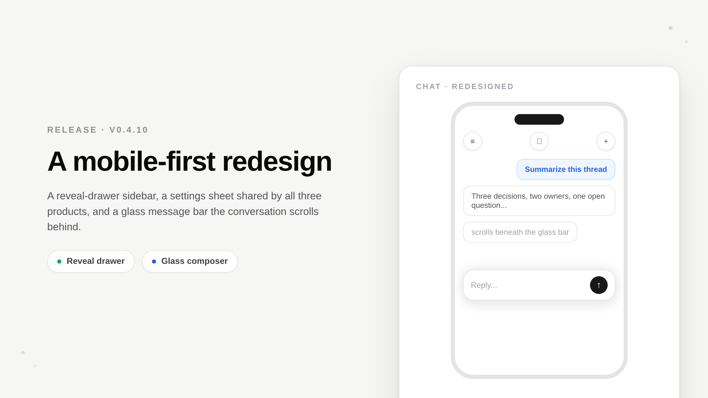
v0.4.10 rebuilds the phone experience around native conventions - a reveal-drawer sidebar, a settings sheet shared by all three products, swipe-to-manage chats, a keyboard the composer follows, and a glass message bar - and closes a set of production bugs around credits, error visibility, and dead tunnel connections.
On this page
Foxl v0.4.10 is a mobile-first release. The web app at app.foxl.ai and the iOS build were rebuilt around the conventions people already expect from a phone: a reveal-drawer sidebar, a settings screen that slides up as its own layer, swipe actions on chat rows, a keyboard that the composer rides smoothly, and a glass message bar that the conversation scrolls behind. The same release also closes a set of production bugs that were quietly breaking chat for some accounts.
Why this release
Foxl runs the same React bundle on the desktop app, the web app, and iOS. That is efficient, but it meant the phone inherited desktop patterns: a sidebar that floated on a black scrim, a settings page that lived in the content column, chat rows that needed a long-press, and a composer that stuttered as the keyboard rose. None of those are wrong on a laptop. All of them feel wrong on a phone. This release keeps the desktop untouched and gives the phone its own treatment where it matters.
What changed on mobile
A reveal-drawer sidebar
Opening the sidebar no longer floats a panel over a dark overlay. The sidebar is now a base layer pinned to the left edge, and the app content is a glass card above it. Tapping the menu slides the content card to the right and scales it back a touch, so the sidebar underneath is revealed - the content is a lid that slides off, not a panel that pops up. The card recedes evenly from a left-center origin, so it reads as pushed back rather than shrinking in height.
Settings is a native sheet, shared by all three products
On the phone, Settings slides up from the bottom as its own glass layer over the app - the sidebar stays put beneath it, the way an iOS modal leaves the screen behind it visible at the top. It has a single round back button and a centered title, and sections push in from the right and pop back like a native settings app. Your Account, Integrations, Mobile/Web connection, and Usage all moved inside it, and Foxl Notes and Foxl Code settings are sections here too - one Settings screen for all three products instead of three scattered menus. Each section loads on demand, so the sheet opens instantly. The desktop keeps its familiar two-pane Settings page unchanged.
Swipe to manage chats
Chat rows in the mobile sidebar now swipe left to reveal Rename and Delete, replacing the long-press menu that was easy to miss. The row tracks your finger as you drag and settles with a spring; tapping an open row closes it. On desktop the right-click menu and hover actions are unchanged.
A keyboard the composer follows
Tapping the input used to stutter as the composer rose, because the layout transition ran on a different curve than the iOS keyboard and every animation frame fired scroll events that re-rendered the chat mid-animation. The shell now animates on the keyboard's own timing curve, and scroll-state updates pause until the keyboard settles, then reconcile once. The chat also follows a long answer as it streams again - when a single reply or thinking block grows tall, the view stays pinned to the bottom, and it still hands control back the moment you scroll up.
A glass message bar
The composer is now a translucent glass card that the conversation scrolls behind, with a crisp hairline edge and a soft shadow that lifts its top and bottom edges evenly. In dark mode it is a soft gray card rather than the near-black it had become. Foxl Code's composer - both the task-launch bar and the in-task chat - matches the same treatment, and its scroll-to-bottom control is now a round button on the right, like Foxl Agent.
The production fixes
Free accounts locked out with credits showing
A single oversized agent turn could overdraw the internal balance by more than a month's grant, and that debt silently carried across months. Every later request then failed with "Credits exhausted" while the Account page still showed credits available. Monthly free credits are use-it-or-lose-it, so the refill now also clears any carried overdraft, and affected accounts were reset.
Chat errors are visible again
A regression had dead-wired the persistent error banner, so a failed send - out of credits, a plan-gated model, a relay error - produced no feedback at all; the reply simply never came. The banner is rewired: credits and plan issues show the upgrade prompt, other errors show the real message.
Gateway timeouts from a dead desktop link
When a desktop's tunnel socket died silently - sleep, wake, a network switch, with no close event ever arriving - the relay kept writing every request into the dead socket for up to two minutes. Each one waited its full ten-second timeout and failed with a 504 while the dashboard still showed the desktop as green. A live desktop always answers within eight seconds, so the relay now treats one full request timeout as proof the socket is dead: it closes it and flips the desktop offline immediately, and the desktop redials within about a second. Read requests that land exactly on the dying socket retry once after that redial, so the healing is invisible instead of an error flash.
Chat-complete notifications on mobile
Send a message from the phone, switch apps or lock the screen, and Foxl now delivers a system push when the response is ready; tapping it opens that conversation. The push only fires when the app actually stopped watching the stream mid-turn - foreground chats never notify.
Upgrading
The web app updates automatically. The desktop app updates itself, or you can download the latest build from the Foxl homepage. The full list of changes is in the changelog.
References and further reading
- Foxl v0.4.10 changelogRelease
- Download FoxlReference